GOOD
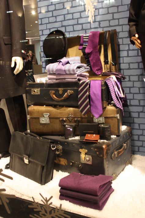
This window display does a great job with portraying what this company has to offer. It clearly shows that this store is selling formal male clothing items. Even though this display has a lot of props used, the store knows how to emphasis the selling point, which are the ties, shirts, belts, and socks. They do this by using the specific color of purple for the male clothes. The brick blue wall and the fur floor gives tension, which is how a surface feels by touch and how it appears that it might feel like.
BAD
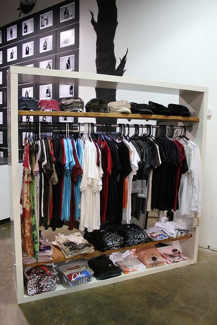
The picture above is not an example of a good store display. For starters, the only thing that would make the customer surprised would be how extremely overwhelming it is to look at because of the sequence the clothes are put into. It looks as if the employee just threw the items on the rack and called it a day. There is no harmony with the colors of the garments, which could have made the display a little more presentable than what it is in the picture. When looking at this display the emphasis is on the shirts, but the hats at the top just seem to be out of place and randomly put on the top shelf. All in all, this display would not draw a customers attention to take a little time out of their day to look at what this clothing rack offers.
