GOOD
Target
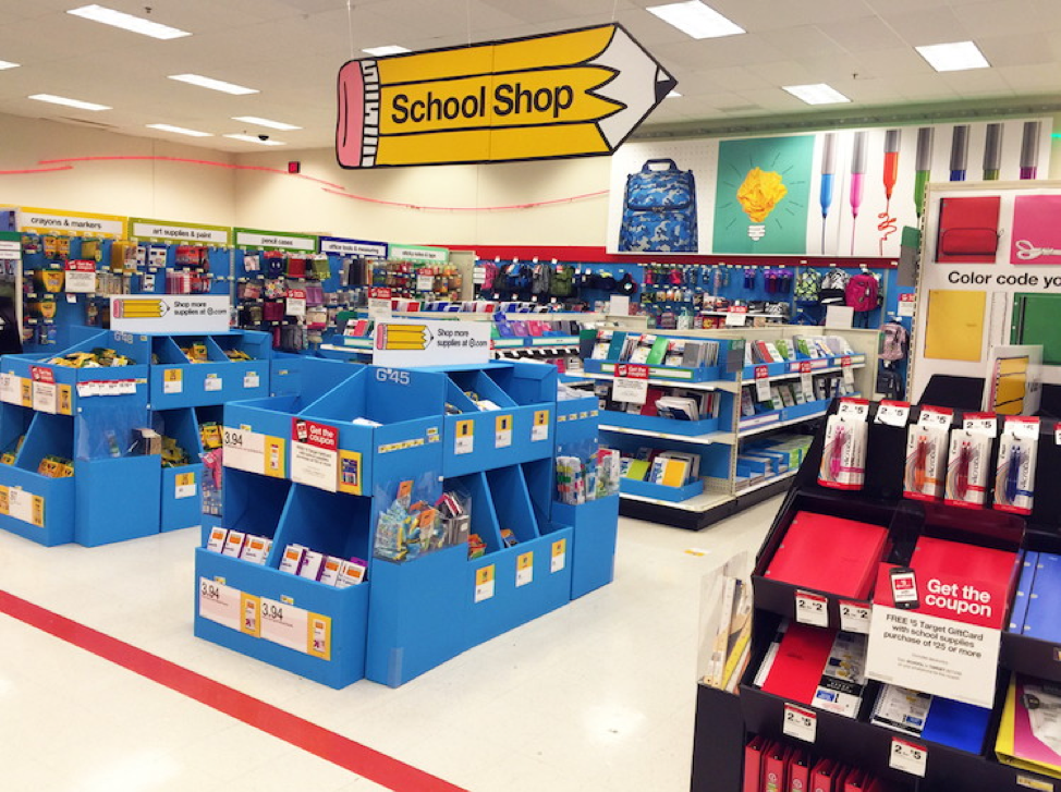
The back to school signs is extremely necessary for a store to put on display in the months of August and September. Those two months are the main months when people by their school supplies and the store makes a huge profit. In this picture above, is an operational sign meaning it tells the customers the location of this department. This is an example of a good display due to the fact, it is hanging high enough for customers to see from the distance, it is eye catching, and the font. It is eye catching considering it is a giant pencil hanging from the ceiling and that it screams school supplies when looking at it. Also, the letters of the words “School Shop” are lowercase and from class lecture, lowercase letters give off the sense of friendliness and it is easier to read than putting all capital letters. It is important to give off the sense of friendliness in a school supplies department because the target market is mainly children and the store is trying to make it a fun and exciting event for the children to go school supply shopping.
BAD
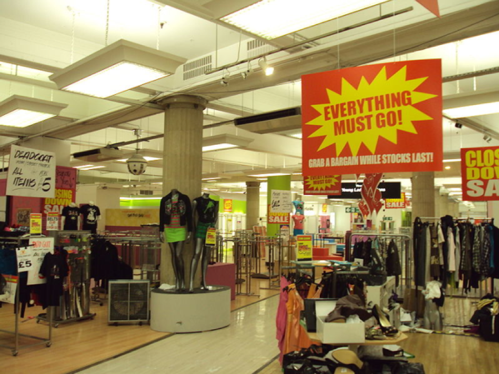
Promoting closing down sales for a store is important because the store wants to make as many sales as they can and to get rid of items, but the way this store above went about it looks tacky. The reasoning for why in my opinion it looks tacky is because of the color choice for the signs. Just like red and green reminds people of Christmas, the color choice yellow and red reminds me of McDonalds, which is odd that a clothing store is reminding me of a fast food restaurant. Even though the signs are hanging up and they are easy to point out, they are too distracting and are taking away from the clothing items. The signs already are big and are hanging that there doesn’t need to be an excessive amount of them being displayed. Also, the letters are all capitalized, which is harder to read compared to a lowercase font.
