GOOD
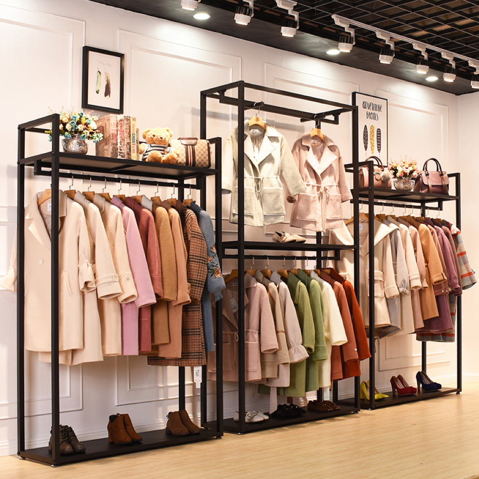
This display is a good display due to the fact that just looking at it is pleasing to the eye for many reasons. For instance, the lighting used is ambient lighting and it is best for a retail store because it influences the lighting on each level of the store meaning the light hits the ceiling, wall, and floor. Having the light hit every level of the store, allows the customers to be able to see the color palette used in this display. The color palette used two groups, neutrals and muted/dusty and this is allowed because you can mix two groups together only if one of the groups is neutral. Also, another reason why it is a good display is because it is formally balanced meaning the items are equal in size or weight and is symmetry.
BAD
Forever 21
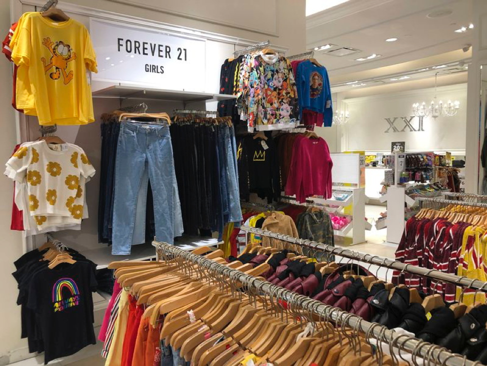
Even though this display has a good lighting system to be able to see the shirts, the way that it is put together is not an excellent way of showing off the shirts. Some of the shirts and jeans are hidden behind other ones, which may be hard for customers to see the designs of the ones in the back. Also, being a regular customer for Forever 21, I have noticed that when physically going into the store it is not organized. The items are just prompted up there and the sizes are not in order of smallest to the largest. This display is also informally unbalanced with having one column of shirts on the left side and two columns of shirts on the right. It is somewhat overwhelming when stepping into the store and this display is a good example of what a bad display looks like.
